Culture
Pride flags explained: the rainbow, Progress Pride and what symbols can tell you
Understand the original rainbow flag, later designs and identity flags, with clear limits on using colours to guess someone's identity or beliefs.
Pride flags are symbols people use to express identity, solidarity, community and visibility. The rainbow flag is a broad symbol associated with LGBTQ+ communities. The Progress Pride design adds a chevron to direct attention towards people who have been marginalised within those communities. Other flags make particular identities visible. No single flag is compulsory, and seeing one does not tell you everything about its owner.
To understand a flag, separate three questions: which design is it, what meaning did its creator or community give it, and how is someone using it here? Those answers may overlap without being identical. A flag can carry a documented history while also holding a personal meaning for the person displaying it.
The original rainbow had eight colours
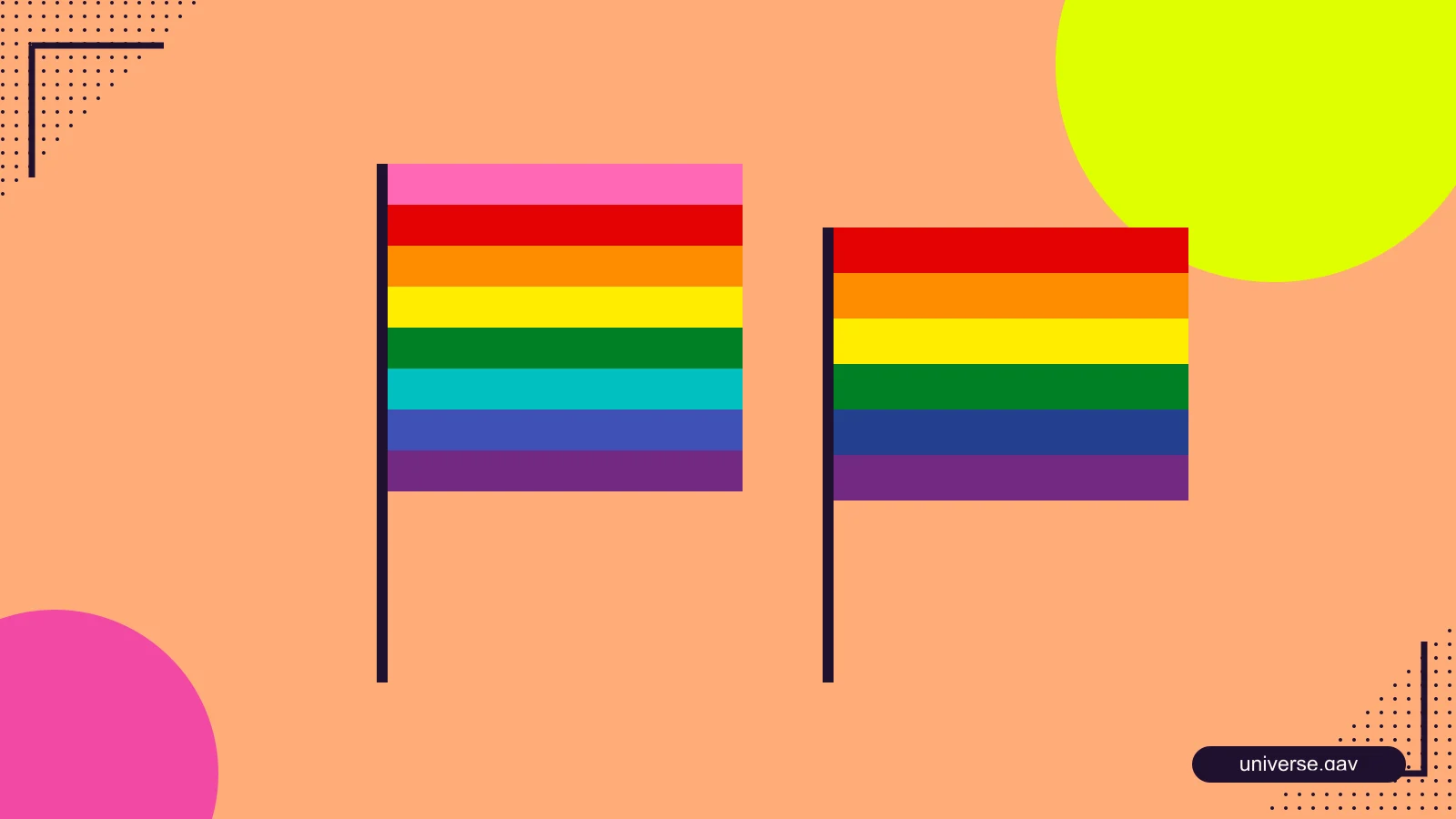
The Gilbert Baker Foundation describes the original rainbow flag from 1978 as an eight-colour design. The meanings it presents are pink for sex, red for life, orange for healing, yellow for sunlight, green for nature, turquoise for magic and art, indigo for serenity, and violet for spirit.
Those meanings belong to the symbolism of that version. They are not a scientific classification or a set of promises made by every person using a rainbow. The stripes were not created as one stripe for each letter in LGBTQIA+. The acronym and the flag should not be forced into a matching exercise.
Baker’s account describes a search for a positive shared symbol. That context helps explain why the rainbow can function as a broad sign of visibility rather than a narrow badge belonging to only one orientation. It also reminds us that a familiar symbol was a creative decision made in a particular time and setting.
Do not confuse the eight-colour and six-colour designs
Many people recognise a rainbow flag with six stripes: red, orange, yellow, green, blue and violet. It is visually different from the original eight-colour version. If you are describing a specific image, name the version you can actually see rather than attaching the eight original meanings to six stripes as though nothing changed.
You do not need to know the full design history to use a rainbow respectfully. But if you are writing an explanation, teaching a class or printing an information panel, the distinction matters. A simplified graphic can easily become a misleading historical claim when its caption says “the original flag.”
For a practical example, imagine a school display showing a six-stripe image beside a list of eight meanings. The problem is not the use of a rainbow. It is that the image and explanation describe different designs. Correcting the caption or using the appropriate image makes the information clearer.
What Progress Pride adds
Daniel Quasar’s Progress Pride design combines the rainbow with a chevron using colours associated with trans visibility and black and brown stripes that draw attention towards marginalised communities. The creator describes the directional form as part of its message about movement and work still to be done.
The chevron is not simply a decorative border. Its placement changes the visual emphasis and invites a conversation about whose experiences remain less visible. That is a more useful explanation than saying it is a newer flag that has automatically replaced every earlier rainbow.
Progress Pride is one design among several. Variants that add intersex symbolism or make other changes have their own creators and histories. Do not attribute every flag with a chevron to the same person or assume one creator is responsible for every later adaptation.
Identity flags make more specific experiences visible
Flags associated with bisexual, transgender, asexual, nonbinary and other identities can help people recognise a shared vocabulary or signal a part of themselves. Some people display a specific flag alongside a broad rainbow. Others use one symbol, several or none.
The useful approach is to identify the design before explaining it. Similar colours may appear in different flags, and a stylised illustration can change their order or proportions. If you cannot establish which flag is shown, say what you know rather than inventing a meaning from the palette.
A person using a specific flag may welcome a respectful question, but they do not owe you a personal account. You can ask, “Would you like to tell me about this design?” without asking, “So exactly what are you?” The first leaves room for a conversation about the object; the second turns it into a demand for classification.
A symbol does not give you permission to out someone
Someone may wear a pin privately, use a small symbol online or attend an event without wanting a public label attached to them. A flag can indicate identity, support, interest or connection to another person. You should not announce an orientation or gender based only on what you see.
The same care applies to photographs. Before posting an image of someone at a Pride gathering or beside a flag, ask whether they want it shared, tagged or named. Their presence in a public place is not the same as agreement to every future audience you can reach.
Our guide to digital privacy explains why visibility is made of many small decisions. A caption, location tag and shared group photo can reveal more together than any one element appears to reveal alone.
Choosing a flag for a space or event
Begin with the message and the people the space serves. A broad LGBTQ+ event may use a rainbow or Progress Pride design. A discussion focused on a particular identity may use a relevant identity flag. There is no need to turn the choice into a claim that every participant has the same preference.
Ask a more practical question as well: what makes the welcome real? Are people addressed accurately, can they attend without unwanted photography and does someone respond to degrading remarks? A flag can signal an intention, but it cannot perform those tasks by itself.
If you use several flags, provide readable names in text where explanation matters. Colour alone may not communicate the distinction to every visitor, especially in small icons, poor printing or low contrast. A short caption can make a display more useful without filling it with tiny text nobody can read.
Keep a diagram separate from a historical photograph
A diagram can accurately show a design without being a record of an event. A photograph can show who displayed a flag in a particular setting, but it also introduces questions about date, location and image ownership. Label the material according to what it actually is.
For example, a newly drawn rainbow labelled “design illustration” is not evidence of what appeared at a march decades ago. If the historical appearance matters to your claim, use a verified image or record of that occasion. If the purpose is to explain stripe order, a clear diagram may be the more useful choice.
Avoid altering a flag carelessly while presenting it as an exact guide. Stretching a chevron, swapping colours or cropping part of a symbol may change the design being explained. Decorative use has different needs from a reference image, and the caption should make the purpose clear.
Check rights for the actual asset you use
A design’s permission terms and a photograph’s rights are separate matters. Even where a flag design is freely reusable, a photograph of it may belong to a photographer. A shop listing, social post or search result does not automatically grant permission to copy the image.
At the time this guide was researched, Quasar’s own Progress Pride site stated that the design was available under CC0 for commercial and noncommercial use. Check the creator’s current statement for the exact asset you plan to use. That statement does not make unrelated photos, logos or later designs free by association.
Credit should describe the real source. If you draw a diagram from a documented design, identify the design and your illustration honestly. If you reproduce a photograph, preserve the photographer or source information you actually know rather than inventing a licence.
Let the symbol open a better conversation
Knowing the difference between the original rainbow and a later design can deepen understanding. It can also become a way to police people if every pin or banner is treated as an exam. Use what you learn to explain an object accurately and ask thoughtful questions, rather than rank someone’s belonging by their preferred flag.
The strongest reading holds history and personal choice together. A flag has a design, a context and a set of meanings people discuss. The person carrying it still has the right to decide what they share about themselves. Respecting both makes the symbol more useful than a shortcut for guessing.